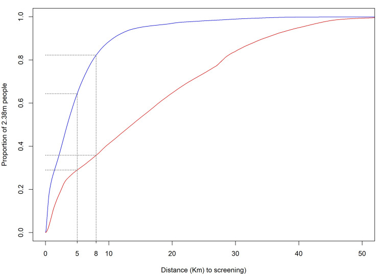
Fig 3. Cumulative distribution plot of the population’s distances to screening facilities using HAT RDTs or CATT.
The red line represents the distance to HAT screening prior to the programme, the blue line is the distance following the start of the programme and the black lines the coverage at the 5 and 8km targets of the DRC Ministry of Health. Data on population are from [19].

