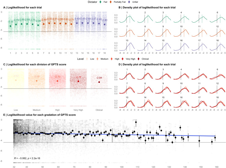
Fig 1. Log Likelihood values of the model.
(A) Computed mean log likelihoods for each trial, coloured by dictator type. (B) Density plots of log likelihood values for each trial, coloured by dictator type. Coloured lines represent group means (C) Computed mean log likelihoods for each GPTS score quantile and clinical score cut off (Green et al., 2008). (D) Density plots of log likelihood values for each trial across each GPTS score quantile and clinical score cut off (Green et al., 2008). (E) The association between GPTS scores (minimum score = 32) and loglikelihood values. Dots = mean loglikelihood value across that score of the GPTS. Lines = 95% confidence intervals. The grey line in each plot (at -4.394) represents the loglikelihood that would be observed if the model was capturing behaviour by chance.

