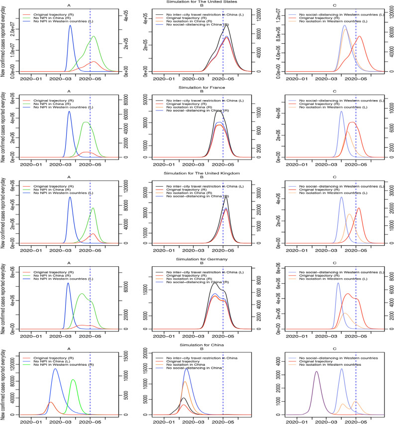
Figure 8.
Simulations of the third scenario. Curves of different colors represent trajectories of daily new confirmed cases reported for four selected Western countries and China in different occasions where less or none NPI were executed from January 23rd, 2020. Subplot A draws scenarios that none NPI were executed in either China or Western countries; subplot B draws scenarios that one kind of NPI was not executed in China; and subplot C draws scenarios that one kind of NPI was not executed in Western countries. In the legend, (L) means being drawn on the left axis and (R) means being drawn on the right axis. The blue dotted line represents May 1st, 2020, the final day of fitting.

