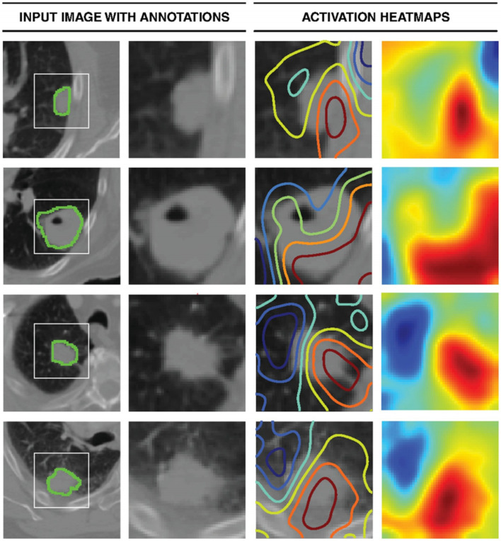
Figure 3. .
Activation mapping. The first column represents the central axial slice of the network input (150 × 150 mm) with tumor annotations. In the second column, a 50 × 50 mm patch is cropped around the tumor. In the third column, activation contours are overlaid, with blue and red showing the lowest and highest contributions (gradients), respectively. Column four represents the activation heatmaps for a better visual reference.52

