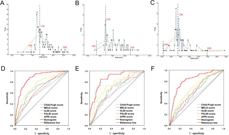
Fig. 4.
a Total points distribution of false positive events (blue polyline). The X-axis represents the total points used to predict the risk of grade B/C PHLF, the Y-axis represents the frequency of false positive events. The red dotted line represents the fitted line and presents a normal distribution. a Training cohort, the false positive events were concentrated around the maximum value 175 point, and close to the preset cutoff (169 points). b Internal validation cohort, the false positive events were concentrated around the maximum value 170 points. c External validation cohort, the false positive events were concentrated around the maximum value 176 points. b Comparison of predicative performance for predicting grade B/C PHLF between the nomogram and conventional scores: a Training cohort, b Internal validation cohort, c External validation cohort

