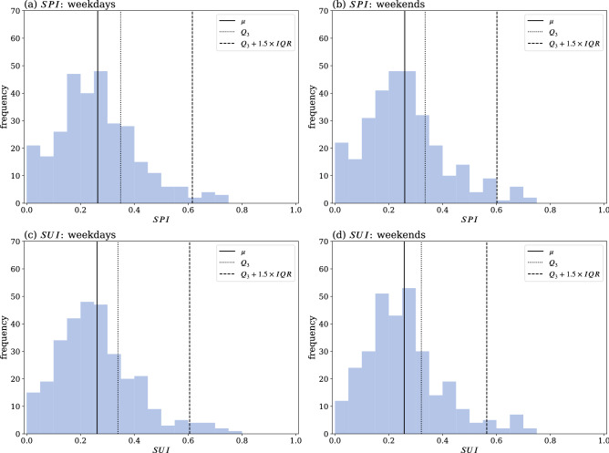
Figure 8.
Frequency distribution of the SPI and SUI. Top row (a,b): SPI; Bottom row (c,d): SUI; Left column (a,c): weekday flow movement; Right column (b,d): weekend flow movement. The vertical solid lines indicate the mean value of the distributions, and the vertical dashed lines refer to values beyond , with being the third quartile (dotted lines) cut-off value and IQR the interquartile range. Subzones that lie outside the dashed lines are the subzones with the highest spreader or susceptible indexes, which are identified as the spatial super-spreaders and super-susceptibles.

