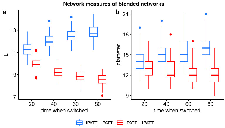
Figure 4.
Boxplots of ASPL (a) and network diameter (b) values of networks grown via blends of preferential attachment and inverse preferential attachment. The x-axis indicates the percentage proportion of nodes added before the network algorithm was switched. Red bars indicate networks first grown by PATT followed by inverse PATT. Blue bars indicate networks first grown by inverse PATT followed by PATT.

