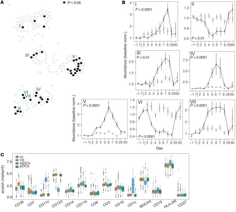
Figure 7. Kinetics of Scaffold cell clusters during H1N1 infection.
(A) Nodes colored black on the Scaffold graph (see Figure 6) indicate clusters with significant differential abundance between shedders and nonshedders (P < 0.05, Bonferroni’s adjusted P value of the time-shedding interaction term). The locations of the 7 Scaffold clusters selected for further analyses are indicated by Roman numerals. (B) Line plots showing abundances (percentage of total clustered cells) (mean ± SEM) normalized to baseline (average of day –1, 1) in Scaffold clusters indicated in A. Data for virus shedders are indicated with filled squares and solid lines, and data for nonshedders are indicated with open squares and dashed lines. (C) Box plots showing expression levels of indicated cell surface markers in Scaffold clusters VI and VII relative to manually gated myeloid and plasmacytoid DC landmarks. Note differential expression of CD38. (A–C) n = 35 volunteers. Bonferroni’s adjusted P value of the time-shedding interaction term. For additional box plots showing all markers for Scaffold clusters I–VII, see Supplemental Figure 7.

