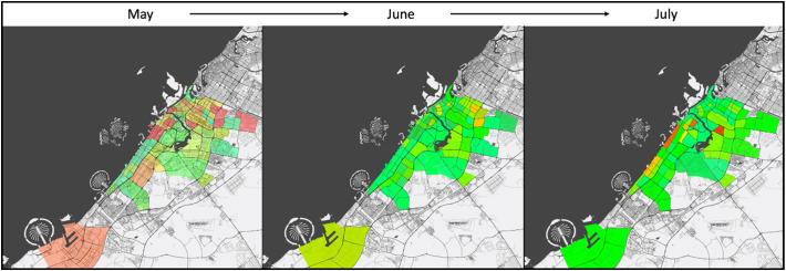
Fig. 3.
The results of second stage displayed as a heat map of the whole city over 3 months' period. The results showed decreasing of viral load concentration over the 3-months period. Heat maps provide a visualization of the overall prevalence throughout the city. Dark red color represents high concentration of viral load; yellow color represents moderate concentration of viral load; and green color represents low concentration of viral load. (For interpretation of the references to color in this figure legend, the reader is referred to the web version of this article.)

