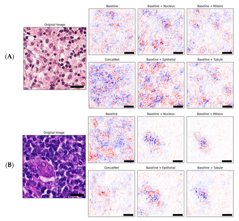
Figure 3.
Example sets of explanations of model attribution for each of the baseline and the proposed models evaluated as compared to the original input image shown on the left. Red is positive attribution towards classification and blue is negative attribution towards classification. Scale bars (black) are shown for 10 microns (10 μm). Original (input) image for (A) shows a benign tissue section while original image for (B) contains malignant tumor cells.

