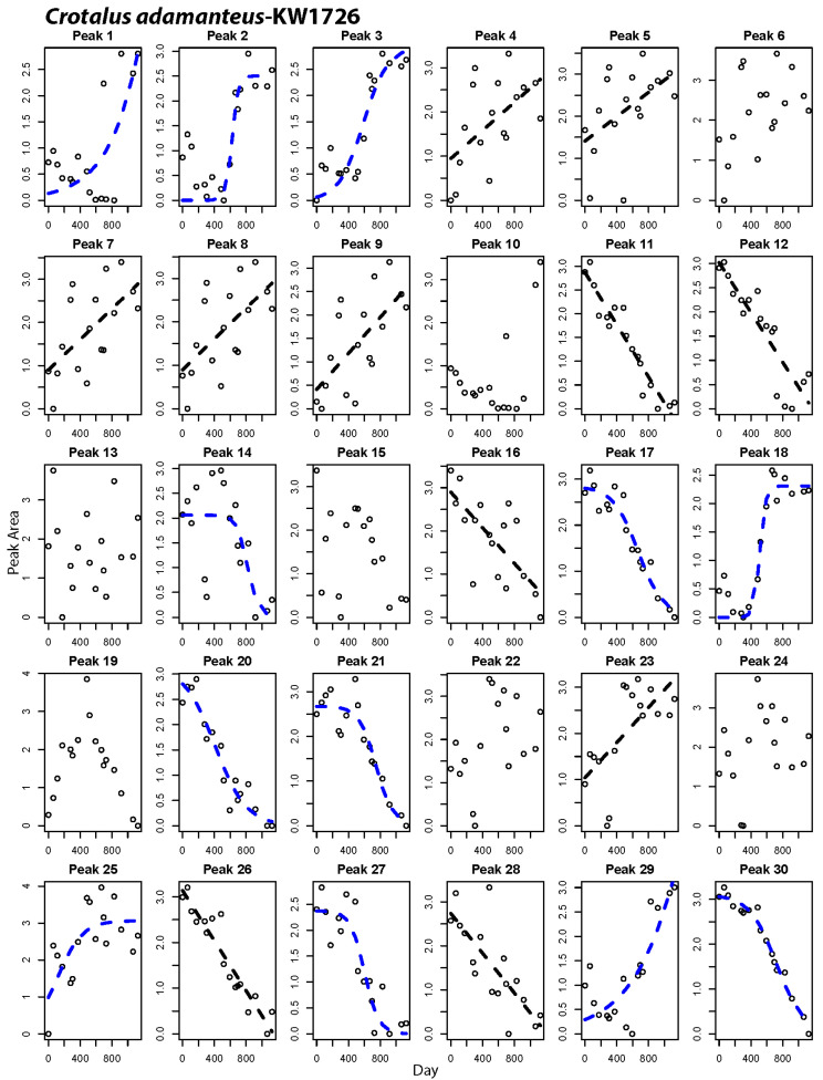
Figure 6.
Peak-by-peak analysis of relative abundance shifts over time for an individual Crotalus adamanteus. Panels with best fit lines indicate peaks that changed significantly in abundance over time. Black lines indicate best fit of a linear model to the data, while blue lines show cases where a non-linear fit was best.

