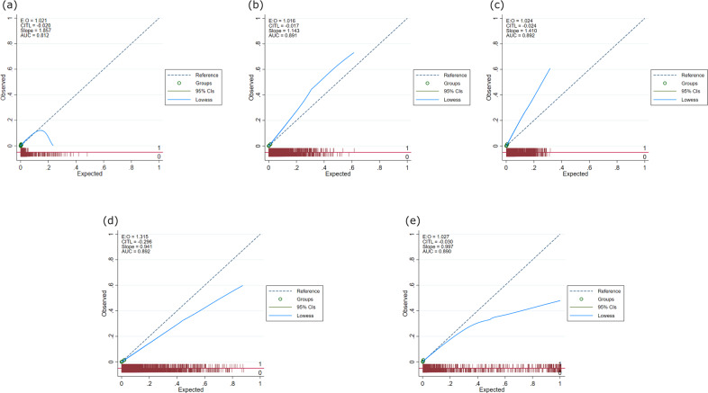
Fig. 4. Calibration plots for all models.
Based on validation cohort of 1,006,943 patients: a logistic regression model, b random forest model, c gradient boosting model, d deep-learning model and e ensemble model. E:O log of the expected/observed number of events, CITL calibration-in-the-large, AUC area under the curve, slope calibration slope. The circles represent deciles of patients grouped by similar predicted risk. The distribution of patients (stratified by outcome) is indicated with spikes at the bottom of the graph. Patients with a diagnosis of familial hypercholesterolaemia (FH) are represented by spikes above the x-axis (red line), and patients without a diagnosis of FH, below the x-axis).

