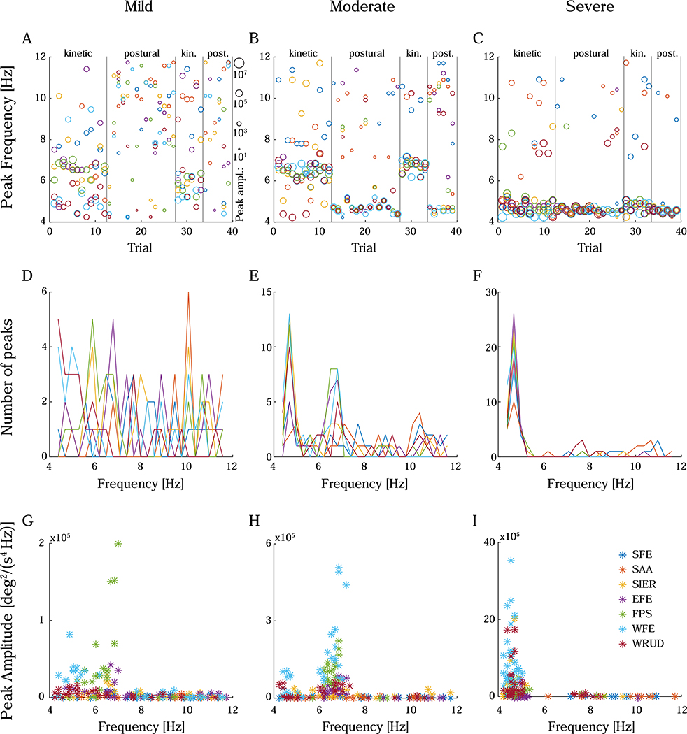
Figure 5:
Peak frequency and amplitude, displayed as peak frequency in chronologically ordered trials (A-C), histogram of peak frequencies (D-F), and peak amplitude vs. peak frequency (G-I). Examples include a subject with mild tremor (left column), a subject with moderate tremor (middle column), and a subject with severe tremor (right column). In severe tremor, peaks tended to group around a common frequency (C, F). Occasionally, peak frequency jumped significantly from one trial to the next, but these jumps appeared random, and the peak frequency returned to the common frequency on subsequent trials. Importantly, the peak frequencies that differed significantly from the common frequency typically belonged to peaks that were much smaller in amplitude (Figure 8F, I). Considering it unlikely that tremor frequency would shift by multiple Hz from one trial to the next, peaks that differed significantly from the baseline were assumed to be spurious (likely due to the increased noise caused by double differentiation). As the amplitude of peaks decreased, the proportion of spurious peaks increased; subjects with mild or moderate tremor (left and middle columns) exhibited more spurious peaks than subjects with severe tremor. In A-C, trials measuring kinetic or postural tremor are separated by vertical bars, and the size of the markers represents the peak amplitude (in deg2/(s4 Hz)) on the log scale shown to the right of subfigure A. The color legend for all subfigures is shown in subfigure I (for degree-of-freedom abbreviations, see Figure 1A).

