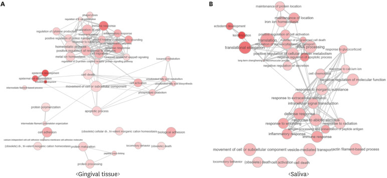
Figure 4. Interactive maps of significantly identified GO biological process terms from the results of (A) tissue samples and (B) saliva samples. The color of the nodes represents the P values in each data set (more intense colors indicate lower P values). The size of each node represents the frequency of GO terms in the underlying GO annotation database, and the thickness of the lines indicates similarity between GO terms. The length of the lines is arbitrary. The maps were visualized using REVIGO (http://revigo.irb.hr).
GO: Gene Ontology.

