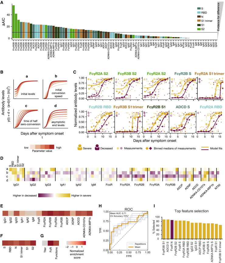
Figure 4.
Dissecting Temporal Differences across Groups
(A) The bar plot depicts the ΔAIC of the model without differences between the groups, where the higher height represents the features that explain trajectory differences best between the groups. The bars are colored according to antigen specificity, and the vertical line (ΔAIC = 10) indicates the commonly used threshold for rejecting models.
(B) Four-parameter logistic growth curves were employed to dissect the specific temporal difference across the groups for each feature. The curves were built by y(t) = d + (a − d)/(1 + (t/c)b), with y(t) describing the temporal evolution of the antibody levels based on the days after symptom. Differences were then split by a = defining differences in initial levels, b = the seroconversion speed, c = the seroconversion time, and d = the asymptotic end levels. The influence of the parameters on the shape of the curve is shown for varying parameter values indicated by the color.
(C) The top 10 different features that differed most between the groups are shown. Dots indicate individual patients, diamonds indicate the binned median, the lines indicate the fitted curves corresponding to the optimal model and the color indicates the group. The specific parameters, which differed for the displayed model, are indicated in the left corner. The dots and lines are color-coded according to the group.
(D) The heatmap shows the Akaike weight averaged parameter differences between the groups. Each row represents a parameter (a, b, c, d) and is normalized across the features, the color intensity depicts how different the parameter is across the groups, and the color indicates in which group the parameter is higher. Along the x axis, individual specificities (S, RBD, N, S1 trimer, S1, and S2) are organized in the same repeating order across each Fc variable that was acquired (subclasses, isotypes, FcR binding, and functions).
(E–G) Normalized enrichment scores (a metric of how different the feature is across the two groups) are shown for individual features collapsed by antigen (E), individual antigens (F), and feature “type” (G). The darker the color the more differentially that feature is expressed across the two groups.
(H) Receiver operating characteristic (ROC) curve shows the model performance in a cross-validation framework. In light blue are the ROC curves for each replicate, and the orange is the mean ROC curve showing overall performance. Mean area under curve (AUC) is reported using the mean ROC curve. Classification accuracy was compared to permutated data and significance was assessed using exact p values of the tail probabilities (∗p < 0.05). TPR, true positive rate; FPR, false positive rate.
(I) Features most often selected during the classification process in yellow are shown and ranked based on the magnitude of the enrichment across severe and deceased individuals.
See also Figures S3 and S4.

