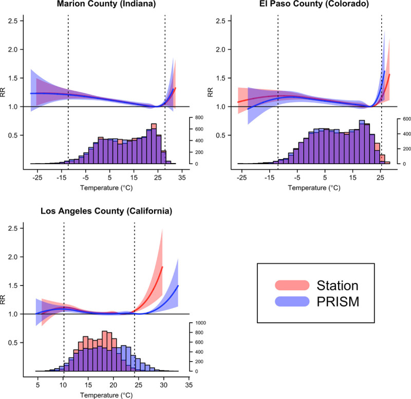
Figure 2.

Exposure–response curves showing relative risks (RR) for the 21-day cumulative association between daily mean temperature and all-ages mortality in three counties modeled using temperature observations from weather stations (red) and population-weighted temperature estimates from PRISM (blue), 1987–2006. Vertical dashed lines are placed at the 1st and 99th percentile of the county-specific temperature distribution as observed at the weather station. RR, relative risk.
