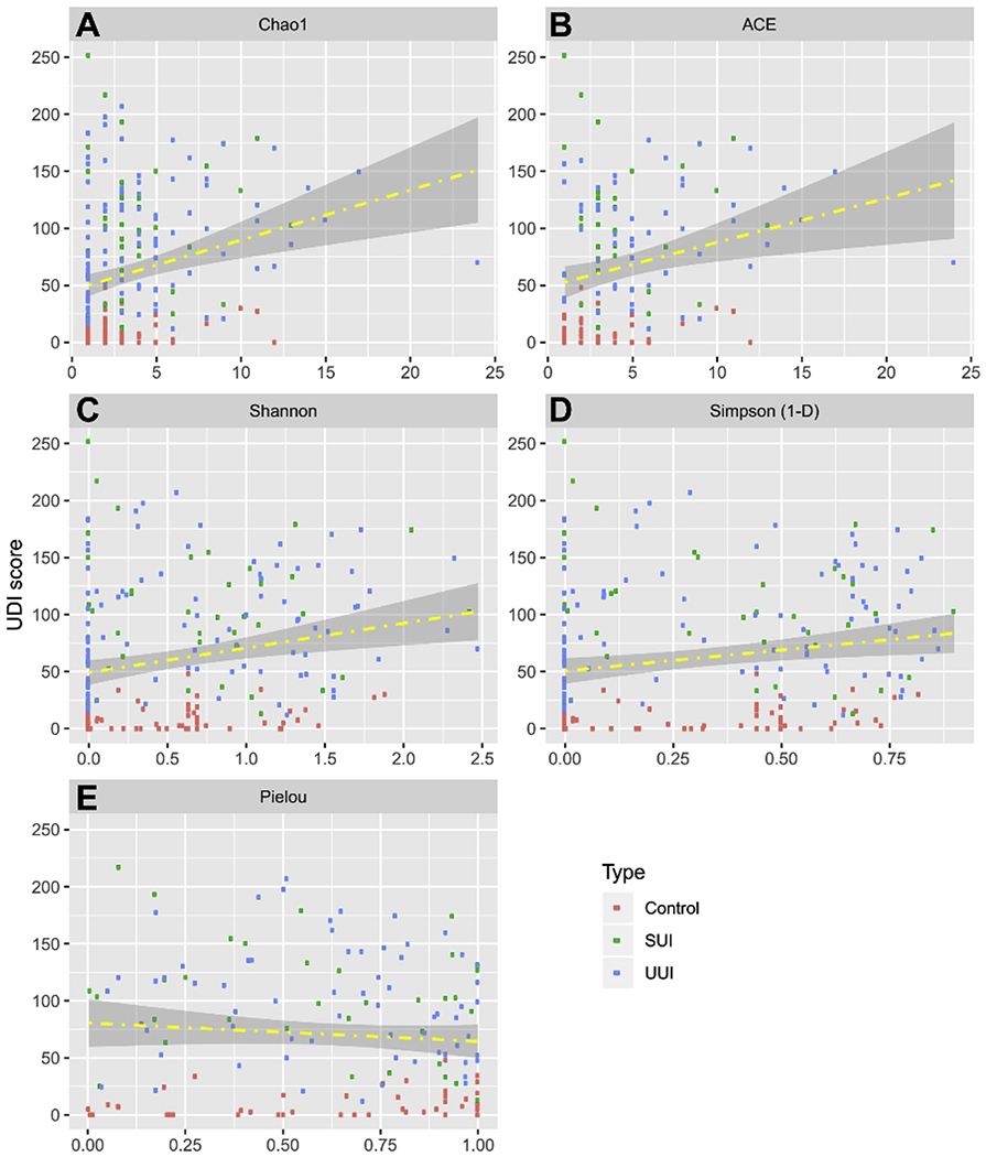
Figure 4. Correlation between alpha diversity and UDI Scores.

Scatter plots depict the distribution of alpha diversity scores calculated from EQUC data on the x-axis. The distribution of UDI Scores is on the y-axis. Fitted regression lines are in yellow. The area between the confidence bands is shaded in grey. Each data point is colored according to cohort, where red is Control, green is SUI, and blue is UUI. A, Chao1; B, ACE; C, Shannon; D, Simpson; E, Pielou. The regression line in the figure serve as a visual aid to indicate the direction of correlation between UDI score and the alpha diversity as quantitatively measured by Pearson, Kandell and Spearman correlation in Table 2.
