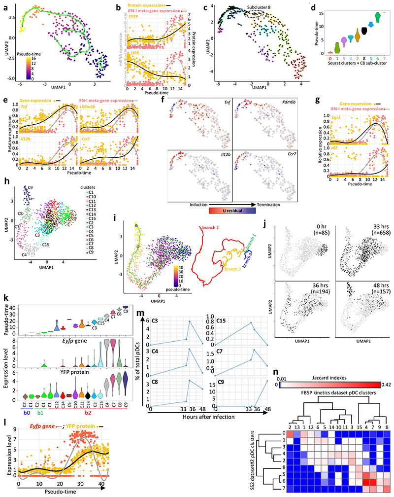
Fig. 4. Inference of the pDC activation trajectory during MCMV infection.
a, Monocle pseudo-temporal inference of the pDC activation trajectory for the SS2 dataset#2. b, Expression of the YFP or LIFR proteins vs the IFN-I meta-gene along pseudo-time. Dots correspond to individual cells and a 6-order polynomial curve was fit to the data. c, RNA Velocity reconstruction of the pDC activation trajectory. Projections of the velocity vector of each pDC are represented as arrows in the UMAP space. The black dotted ellipse corresponds to the new subcluster 8. d, Violin plots showing pseudo-time distribution across Seurat clusters, including subcluster 8. e, Expression along pseudo-time of the indicated genes vs the IFN-I meta-gene, each normalized to their maximal value. f, Predicted induction (red) vs termination (blue) of the transcription of selected genes as obtained using Velocyto. g, Normalized expression along pseudo-time of Egr1 (top) and Id2 (bottom) vs the IFN-I meta-gene. h, UMAP and clustering analysis of the FB5P kinetics dataset after removal of contaminants. i, Pseudo-temporal inference of the pDC activation trajectory obtained using Monocle. j, Distribution in the UMAP space of the cells isolated at different time points after infection. The cell numbers analyzed for each time point (black dots) are indicated in parentheses. k, Violin plots showing the values for pseudo-time (top), Eyfp (middle) and YFP (bottom) expression, across cell clusters. l, Eyfp and YFP expression across pseudo-time. Individual cells are shown as dots and a polynomial curve was fit to the data. m, Calculus of the frequency over real-time of pDCs being in the different activation states (cell clusters) associated to IFN-I production. n, Heatmap showing the equivalences between the pDC clusters from the SS2 dataset#2 and the FB5P kinetics dataset based on the calculation of Jaccard Indexes reflecting their marker gene content overlap. One minus Pearson correlation was used as distance metric for hierarchical clustering.

