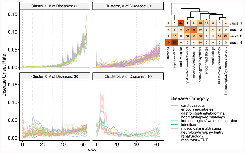
Figure 1.
Age-of-onset profiles clustered by the PAM algorithm, using dissimilarities calculated with temporal correlation measure (CORT). The y-axis shows the number of individuals who were diagnosed with the disease at a certain age, divided by the total number of people having that disease. Values were calculated by taking the median value of 100 permutations of 10,000 people in the UKBB (see Methods). The x-axis shows the age-of-onset in years. Each line denotes one disease and is colored by disease categories. The heatmap in the right upper corner shows the percent overlap between categories and clusters. Numbers give the percentage of an age-of-onset cluster belonging to each category. Supplementary Fig. 8-17 shows the distributions for each disease separately.

