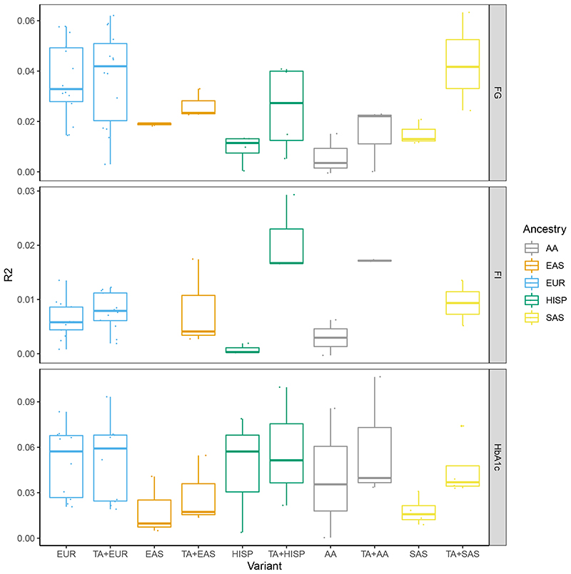
Figure 2. Trait variance explained by associated loci.
The boxplots show the maximum, first quartile, median, third quartile and minimum of trait variance explained when using a genetic score with single-ancestry lead and index variants (EUR, AA, EAS, HISP and SAS) or a combination of individual trait trans-ancestry lead variants and single-ancestry lead and index variants (TA+EUR, TA+AA, TA+EAS, TA+HISP and TA+SAS). Variance explained for each trait (FG, FI and HbA1c) in each ancestry is shown on different panels and in different colors. Data points represent the variance explained in individual cohorts used in this analysis. R2 was estimated in 1 to 11 cohorts with sample sizes ranging from 489 to 9,758 (Supplementary Tables 8-11).

