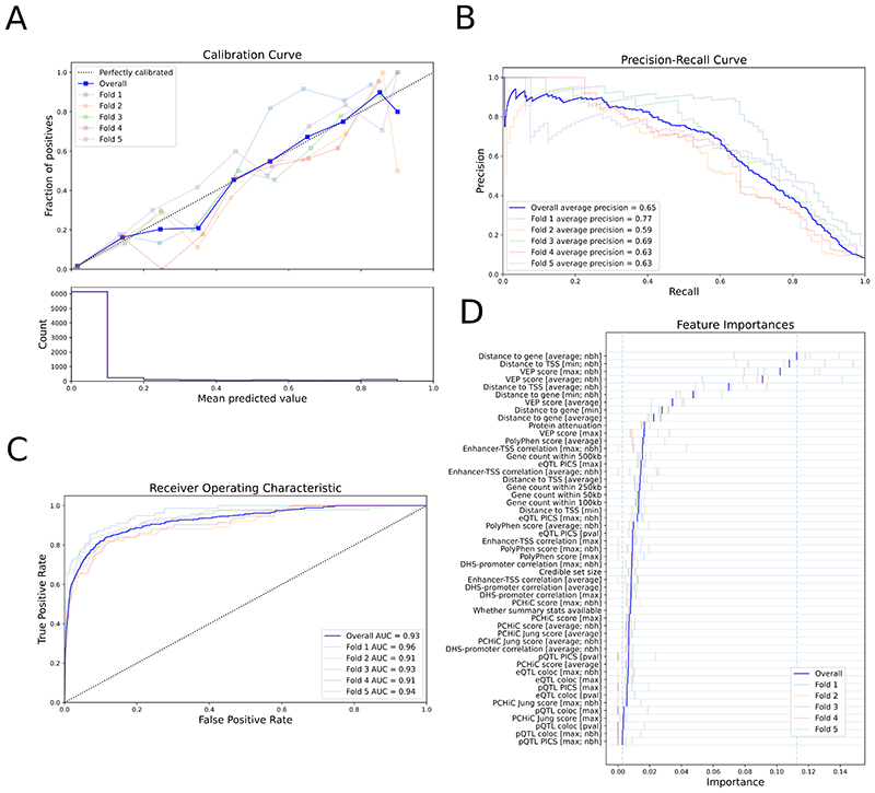
Figure 2. Performance of the locus-to-gene (L2G) model.
Colors show metrics calculated on each individual fold of the 5-fold cross-validation. The overall metric, combining all folds, is shown in dark blue. a, Calibration curve showing (top) the fraction of all GSP genes found as positives at different L2G score thresholds (mean predicted value) and (bottom) the count of genes in each L2G score bin. b,c, The precision-recall curve (b) and the receiver-operator characteristic curve (c) for identifying GSP genes from among those within 500 kb at each locus. d, The Relative Importance of each predictor in the L2G model. Blue vertical bars show the mean importance for each feature in cross-validation, while paler bars show the importance obtained in each fold. The vertical dashed lines show the minimum and maximum mean feature importances. max denotes that the maximum score for any variant in the 95% credible set was used for each gene; average denotes that a score averaged over the 95% credible set, weighted by posterior probability, was used for each gene; nbh (neighbourhood) denotes that scores were calculated for each gene relative to the best scoring gene at the locus. Insets in a-c indicate the chromosomes for which each fold of the data was evaluated in cross-validation, and the average precision (AP) (b) or AUC (c) for that fold.

