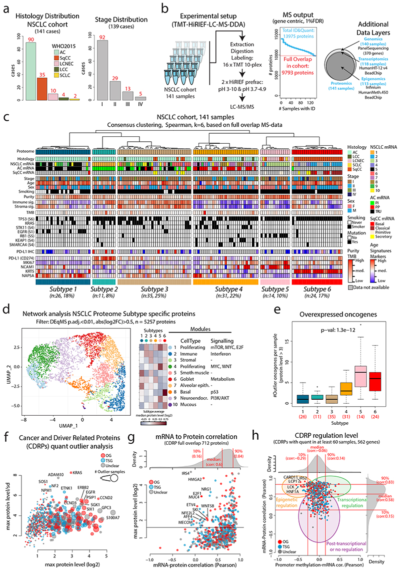
Figure 1. MS-based identification of NSCLC proteome subtypes.
a. Bar plots showing histology and stage distribution in the patient cohort. b. Overview of experimental setup for MS-based proteome profiling, analysis output, and supporting data levels. c. Hierarchical tree showing the results from consensus clustering used to identify NSCLC proteome subtypes. Annotation bars below indicate clinical information of samples, mRNA subtypes, infiltration signatures, common mutations, and protein levels of selected markers. d. NSCLC proteome subtype network analysis with UMAP plot colored by modules (left), modules vs subtypes heatmap (center), and cell types/signaling pathway enrichment analysis output for the 10 modules (right). e. Boxplot indicating the number of overexpressed oncogenes per sample by NSCLC proteome subtype (n = 141 samples). Middle line, median; box edges, 25th and 75th percentiles; whiskers, most extreme points that do not exceed ±1.5 × the interquartile range (IQR). P-value was calculated using Kruskal-Wallis test and the number of samples per subtype is indicated in red. f. Bubble plot indicating cancer- and driver-related proteins (CDRPs) commonly overexpressed in the NSCLC cohort. g. Scatterplot indicating mRNA to protein Pearson’s correlation of CDRPs. The corresponding correlation density plot is displayed on top. h. Scatterplot showing promoter methylation to mRNA correlation vs mRNA to protein correlation for CDRPs. Indicated on top and to the right are the corresponding density plots for the full gene-wise overlap (9,018 genes). Dunn’s multiple comparison tests with Benjamini-Hochberg adjustment for boxplot (e) are available in Supplementary Table 3.

