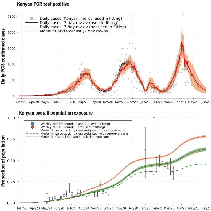
Fig. 2. Daily PCR-confirmed COVID-19 cases (top) and weekly serology estimates from KNBTS donors with overall attack rate estimates (bottom).
Shown are daily numbers of PCR test positives from the Kenyan national linelist (top; gray dots are daily reports used in fitting the model, curves are 7-day moving averages). The model prediction for the 7-day moving average of daily case incidence (top; red dashed curve, shading shows 3-σ intervals) were derived from inference on the county-specific linelist PCR data and rounds 1 and 2 of the KNBTS serology survey (bottom; blue dots). Predictions before mid-April 2021 are back-calculations using known numbers of PCR tests per day, whereas after mid-April 2021, model predictions are forecasts that also estimate the number of PCR tests that will occur per day in each county. We show the next month of PCR test positive data, not used in fitting, as a validation of the model’s short-term predictive accuracy (top; black dashed curve). Back-calculated model estimates of seropositivity (bottom; green solid curve) are shown with round 3 of the KNBTS serology survey data (bottom; red dots, not used in model inference). We also show back-calculated estimates of seropositivity under the assumption that median time to seroreversion (loss of detectable antibodies rather than loss of immunity) from infection was 1 year. Model estimates of overall Kenyan seropositivity are adjusted from county-specific estimates by weighting by number of serology tests in each county (over KNBTS rounds 1 and 2). The overall estimated Kenyan attack rate (population exposure) is shown as unweighted (bottom; red curve).

