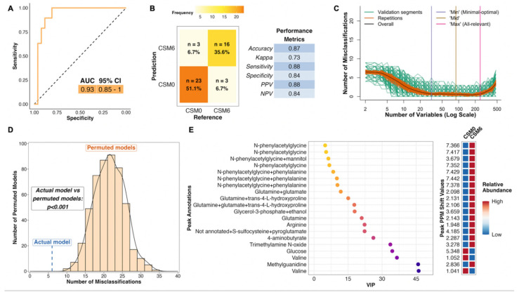
Figure 4.
Multivariate analysis of changes in the urinary metabolome from baseline to month 6 in the CSM arm (all available samples). Number of samples inputted to the MUVR PLS model: CSM0, n = 26; CSM6, n = 19. (A) Receiver operating characteristic curve for the MUVR PLS classification model fit to urinary 1H-NMR peaks for these two groups of samples. Inset are the AUC and associated 95% CI for the curve. (B) Confusion matrix outlining sample classification by the PLS model. The x-axis presents the actual class of the inputted samples. The y-axis presents the sample class predicted by the models. Correctly and incorrectly classified samples are outlined on opposing diagonals of the confusion matrix. Additional performance metrics relating to sample classification at the 50% probability threshold are presented in the table adjacent to the confusion matrix. (C) Recursive ranking and backward elimination of variables (right-to-left on the x-axis) in the inner segments of the MUVR PLS model to achieve optimal validation performance, quantified by the number of misclassifications (y-axis). Green lines represent validation curves per inner segment and may fluctuate. Orange and black lines represent inner segment curves averaged per model repetition and overall (100 model repetitions), respectively, and describe the actual validation performance at higher resolution. Vertical lines outline the number of variables selected in MUVR ‘min’, ‘mid’, and ‘max’ models on the x-axis. (D) Histogram and density curve outlining the distribution of misclassifications by 500 permuted PLS models, in which the Y response vector indicating sample class was randomly sampled. The number of misclassifications by the actual PLS model with the correct Y response vector is outlined on the x-axis by the blue dashed line. A p-value derived from a Student’s t-test comparing the number of misclassifications between actual and permuted models is presented adjacent to the histogram and density curve. (E) Dot plot of the top 20 most important annotated peaks to performance of the PLS model ranked by VIP values. Multiple peaks were identified for certain metabolites. When multiple metabolites are present in a given peak, metabolites are listed in order of relative abundance in the peak, with the most abundant metabolite listed first. The adjacent heatmap illustrates relative abundance of metabolites based on mean peak intensity across all samples in the two groups evaluated by the PLS model. 95% CI, 95% confidence interval; AUC, area under the receiver operating characteristic curve; CSM0, baseline samples from CSM group; CSM6, month 6 samples from CSM group; MUVR, multivariate methods with unbiased variable selection in R; NMR, nuclear magnetic resonance spectroscopy; NPV, negative predictive value; PLS, partial least squares; PPM, parts per million chemical shift relative to TSP-d4; PPV, positive predictive value; VIP, variable importance in projection.

