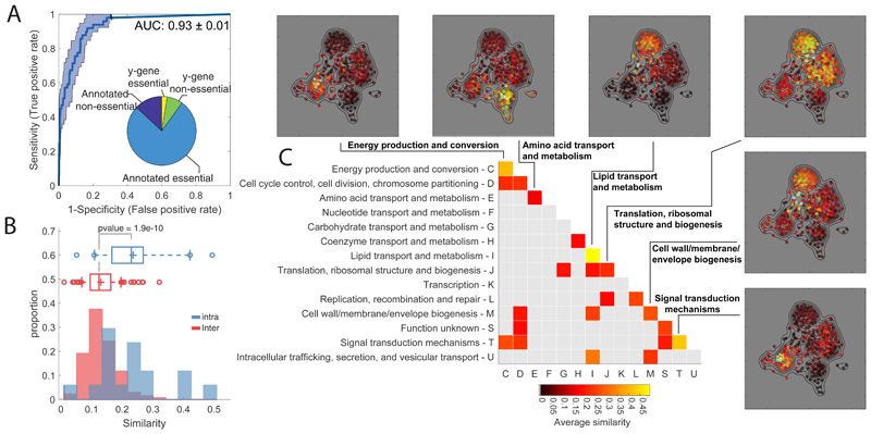
Figure 1. Metabolome profiling of essential gene knockdown.
A) ROC analysis of the similarity between metabolome profiles of non-essential enzyme knockout18 vs knockdown. The pie chart reports the fraction of non/essential genes in the CRISPRi mutant library with characterized vs non-characterized (i.e. y-genes) function. B) Histograms of the averaged similarities between genes from the same (blue) or different (red) functional groups (COG). The tops and bottoms of each box are the 25th and 75th percentiles, respectively, while the line in the middle of each box is the samples median. The lines extending above and below each box are the whiskers. Whiskers extend from the ends of the boxes delimited by the interquartile to the largest and smallest observations. Pvalue estimated by one-tailed t-test analysis. C) Heatmap of metabolome similarity between functional groups (i.e. COGs). For each pair of genes within the same functional group (diagonal) or between two different functional groups (off-diagonal), we estimated the average of similarity scores (iSim) and use a permutation test to estimate pvalue significance. COG names and identifiers are reported on the Y- and X-axis, respectively. Only similarities with pvalue≤0.05 are reported. The similarity between genes of the same functional group is illustrated for selected cases by a 2-dimensional projection of metabolome profiles. Metabolic profile similarities were calculated for all gene pairs by computing iSim. Each dot correspond to a gene knockdown/time point laid out using an edge-weighted, spring-embedded, network layout algorithm30. Genes sharing similar metabolic profiles are proximal to each other; less-similar genes are positioned farther apart. Each dot is colorcoded by the average distance to knockdowns from a specific functional group (green dots).

