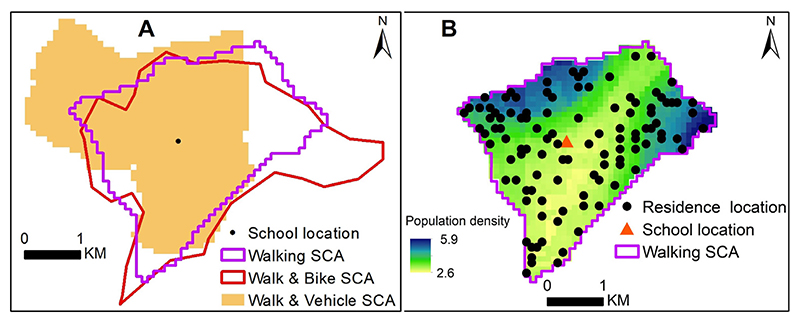
Fig. 4.
A: Sample of school catchment areas generated from each of transport scenarios; walking (Model W), walking and bicycling (Model WB) and walking and motorized (Model WM). The school is shown as a black dot; B sampled locations for a single iteration from one of the catchment areas (Model WB) overlaid on a population distribution map (Stevens et al., 2015) (green to blue shades). In B, the school is shown as an orange triangle. All the school catchment areas are shown in Supplementary material 1.

