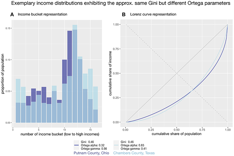
Fig. 1. Plotting the distributions of income for Putnam County, Ohio, and Chambers County, Texas.
A Income bucket representation: The percentage of earners per income bucket is shown for two different counties that have approximately the same Gini coefficient (0.46). B Lorenz curve representation: The same income distributions are plotted as Lorenz curves, which reveals that while overall levels of inequality are the same for both distributions (i.e., the same area under the curve), where inequality is concentrated differs between the counties.

