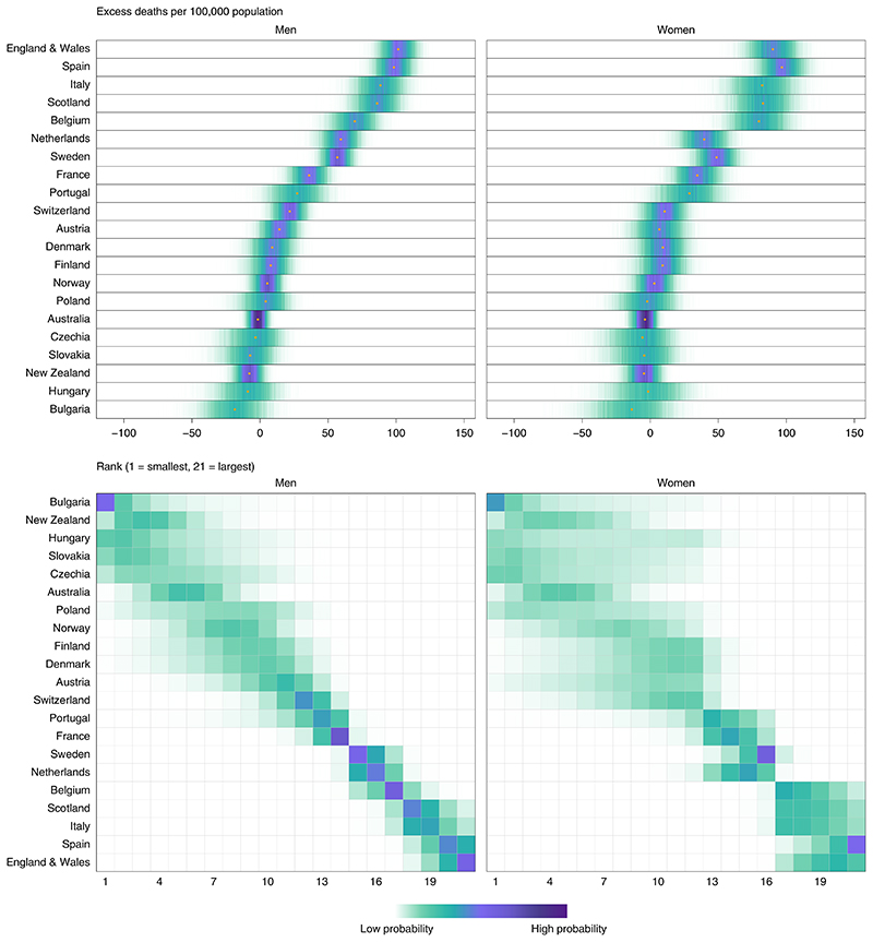
Fig. 2. Posterior distribution of excess deaths from any cause per 100,000 people from mid-February to the end of May 2020 and posterior distribution of each country’s rank.
Gold dots in the top panels show the posterior medians. Countries are ordered vertically by median excess (top panels) and mean rank (bottom panels) in men. Extended Data Fig. 2 shows results by age group. In the top panels, there is a relatively high posterior probability that excess deaths per 100,000 people in each country are in the ranges shaded in dark purple and a low posterior probability that they are in the ranges shaded in light green. In the bottom panels, there is a relatively high posterior probability that each country ranks in the positions shaded in dark purple and a low posterior probability that it ranks in the positions shaded in light green.

