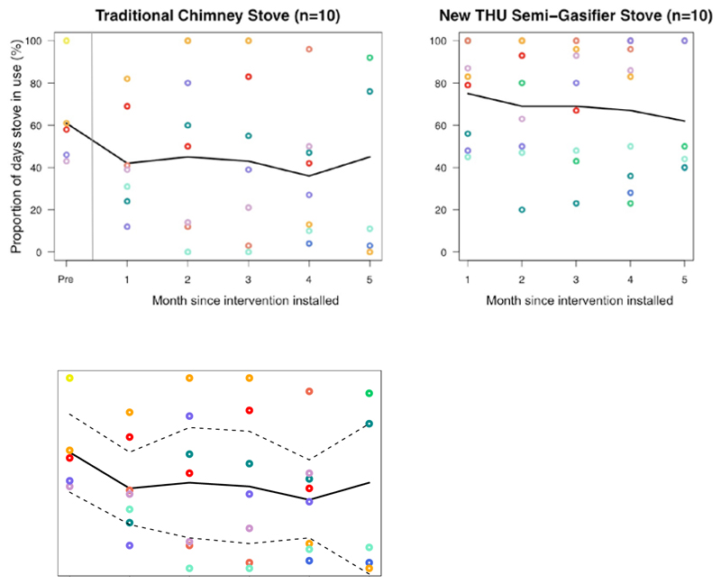
Figure 2.
Average monthly proportion of days the intervention and traditional stoves were in use, pre- and up to 5-months post-intervention, in 10 homes. Circles represent the proportion of daily stove use per month for each household. The solid black lines represent the mean proportion of daily stove use across households in the months since intervention and the dashed black lines indicate the upper and lower limits of the 95% confidence intervals around the mean. Different colored circles correspond to different study homes. Homes contributed a different numbers of months to the analysis due to random temperature sensor breakage.

