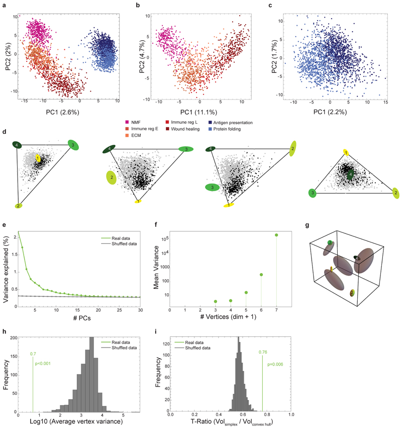
Extended Data Fig. 3. pCAFs and NMFs form a curve in gene-expression space, whereas a tetrahedron describes sCAF gene expression.
a, PCA analysis of NMF, and pCAF and sCAF from 2W and 4W, color coded according to the subclasses defined in Fig. 1c. n=3703 cells. b-c, PCA analyses for NMF and pCAF (b) and for sCAF (c) color coded as in a. n=3703 cells. d, Data projected on the four faces of the tetrahedron. e, Explained variance as a function of the number of PCs (real data) vs. random. Note that the total variance explained by the first 3 PCs, about 5%, is typical of single-cell gene expression data22. f, Variance of vertex positions as a function of the number of vertices considered, using PCHA with k=3-7 vertices. g, Variation of vertex position (bootstrapping) for the real data (ellipses color-coded as in Fig. 3) vs shuffled data (grey ellipses). h, Histogram depicting the average variation of vertex positions calculated for the real data (green) vs multiple runs of shuffled data (grey). i, Histogram depicting the ratio between the volumes of the convex hull of the data and the minimal enclosing tetrahedron (t-ratio). The t-ratio of the real data (green) is compared to t-ratios of shuffled data (1000 shuffles; grey).

