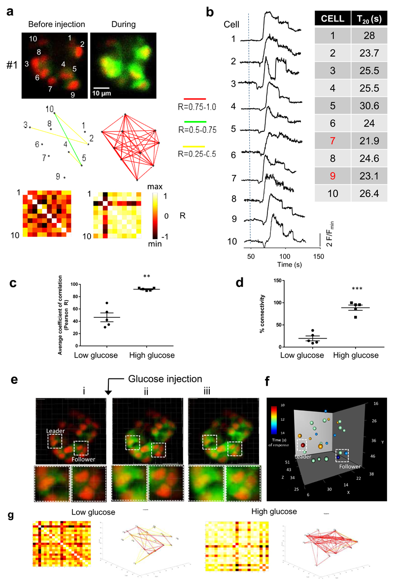
Figure 3. Ca2+ dynamics and connectivity examined in zebrafish during rapid image acquisition.
a. Example islet single confocal slices acquired at 3 frames/s before and during glucose injection. Associated Cartesian connectivity maps and Pearson heatmaps (as described in detail in Figure 2) are given below. b. Ca2+ traces from individual ROIs in the imaged islet. The dashed line represents the time of intracardiac glucose injection. As described in Figure 2, the time to 20% rise in Ca2+ signal post glucose injection was measured, and tabulated in order to identify the first responders or “temporal leaders”. c. Pooled data for the five animals imaged. The mean Pearson coefficient of correlation rose significantly from the low to high glucose state (n=5, data are means ± SEM, p<0.001 on paired two-tailed t-test). d. The percentage of significantly connected cell pairs also increases significantly following glucose administration. Data are means±SEM and **p<0.01 following a paired two-tailed t-test). e. 3D islet projections acquired at 0.8 Hz before and during glucose injection. f. Associated 3D map showing the time of response in a colour-key fashion (red colour represents the fastest response). g. Cartesian connectivity map and Pearson heatmaps for the islet shown in e (n=3 animals, not graphically represented here). The experiment in e,f,g was performed once with three samples showing similar results.

