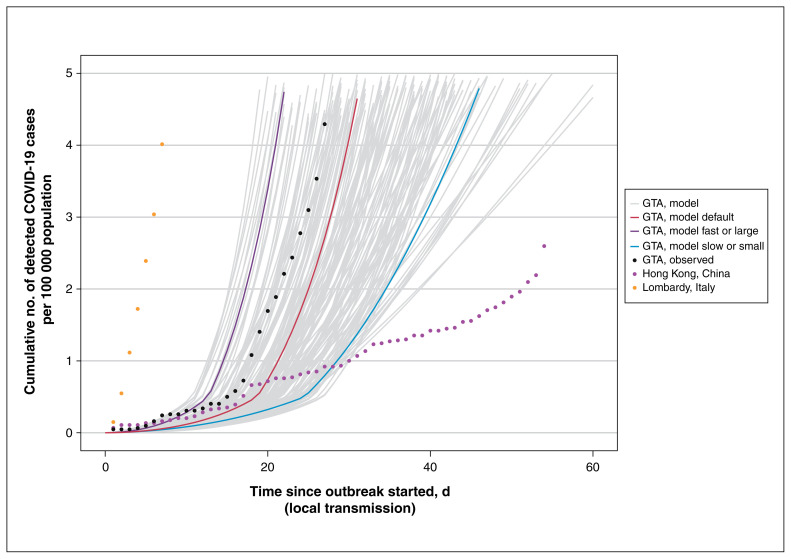
Figure 2:
Cumulative detected cases per 100 000 population across simulated epidemic scenarios and observed data used for epidemic constraints. Model outputs from the sampled range of parameters in Table 1, which meet the model constraints are shown for detected cases as solid lines. The observed data for Lombardy, Italy,61 and Hong Kong, China,62 are shown as dotted lines, and the corresponding data points at day 30 since the outbreak started were used as upper and lower bounds, respectively, to constrain the epidemics. The observed data on cumulative detected cases for the GTA (travel-related and local transmission) up to Mar. 20, 2020, are also shown (dashed black line) as part of the face validity check. The model output for the fast or large epidemic is shown via the purple solid line and slow or small epidemic via the blue solid line, selected as the upper and lower quartile of peak incidence, respectively, within the first 300 days. The default (solid red line) depicts the default scenario (Table 1). Simulated timeline begins at the start of the “seeding” of the population with 0.0011%–0.0048% of the population already infected with severe acute respiratory syndrome coronavirus 2. For observed data, we defined the outbreak to have started when 3 confirmed cases were observed. We chose 3 cases detected as the onset of the epidemic based on the observed epidemic curve in the GTA, where the curve started to take off after detection of 3 cases (Feb. 23, 2020). We applied the same threshold for other regions for comparability of epidemic curves across geographic locations. Note: GTA = Greater Toronto Area, COVID-19 = coronavirus disease 2019.

