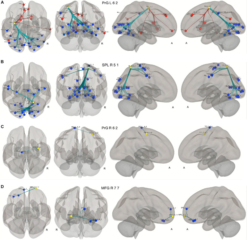
FIGURE 5.
Seed to ROI analysis of the compensatory ROIs. The yellow circles represent the compensatory ROIs. The colored circles depict the ROIs with a significant increase (blue) or decrease (red) of connectivity with the corresponding compensatory ROIs in our two contrasts. (A–C) young HC > senior HC and MCI (p < 0.05, FDR-corrected). (D) Senior HC > MCI (p < 0.05, FDR-corrected).

