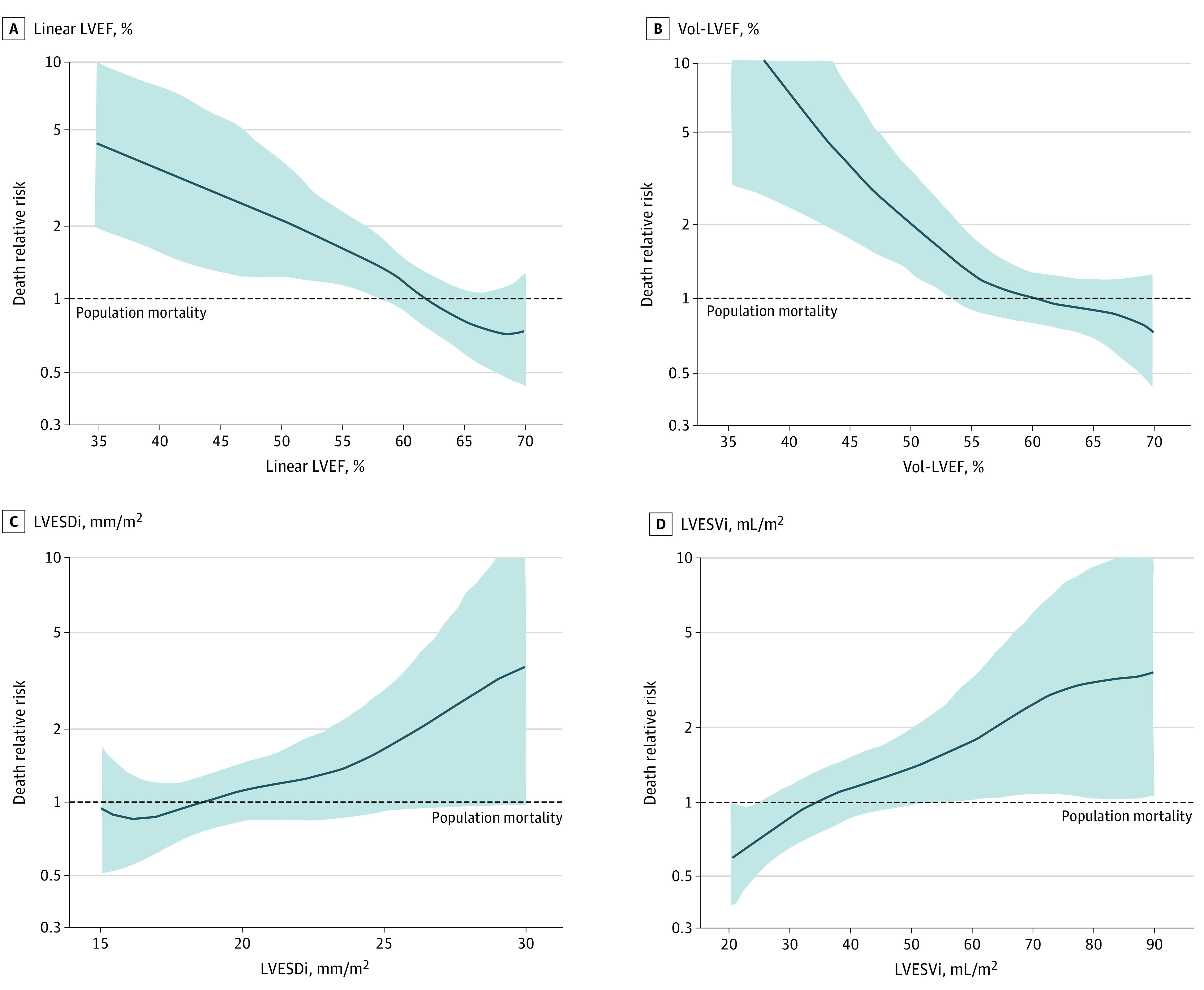
Figure 2. Mortality Under Medical Surveillance Compared With Population Survival.

The y-axis of spline curves in each graph represents risks of excess mortality, with risk of 1 line representing age-/sex-matched normal population mortality, and risk >1 indicating excess mortality. Compared with the general population, continuous risk of death increased with decreasing linear left ventricular ejection fraction (LVEF) (A), decreasing volume-derived left ventricular ejection fraction (Vol-LVEF) (B), increasing left ventricular end-systolic dimension index (LVESDi) (C), and increasing left ventricular end-systolic volume index (LVESVi) (D), crossing the risk of 1 line at similar thresholds as within cohort (Figure 1).
