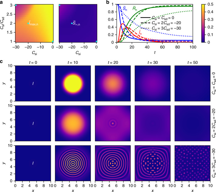
Fig. 1. Phase diagrams and time evolutions for the SIR-DDFT model.
a The shown phase diagrams reveal the dependence of the maximal fraction of infected persons and the final fraction of susceptible persons on the strength of self-isolation Csi and social distancing Csd. A phase boundary is clearly visible. Blue points correspond to the time evolutions presented in the following subfigures. b Time evolutions of the fractions of susceptible (), infected (), and recovered () persons are shown for no interactions (Csi = Csd = 0), moderate interactions (Csi = 2Csd = −20), and strong interactions (Csi = 3Csd = −30). It can be seen that a reduction of social contacts flattens the curve . c The density of infected persons I(x, y, t) is shown for the same three interaction strengths at different times t. For the strongest interactions, phase separation (first into rings, then into single spots) is observed. The color bar applies to Figs. 1a and 1c.

