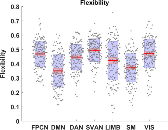
FIGURE 5.

Visualization of summary statistics for network‐specific flexibility across the 4‐year interval. The center red lines represent the mean, and the light red bars and light blue bars represent 95% confidence interval and SD, respectively. This figure was generated using notBoxPlot (https://github.com/raacampbell/notBoxPlot)
