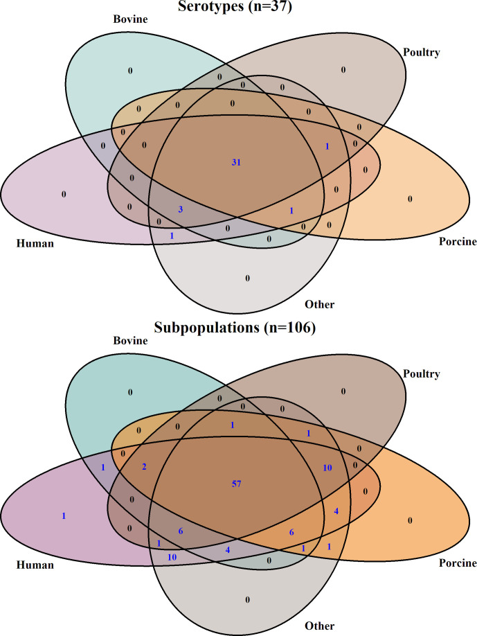
Fig. 2.
Venn diagrams demonstrating the degree of overlap between sources when data were subtyped by serotypes (upper inset) or genetic subpopulations (lower inset). The number of serotypes/subpopulations is indicated within each category (values higher than zero are highlighted in blue). Sources were coloured as follows: human (purple), bovine (blue), poultry (brown), porcine (orange) and other (grey).

