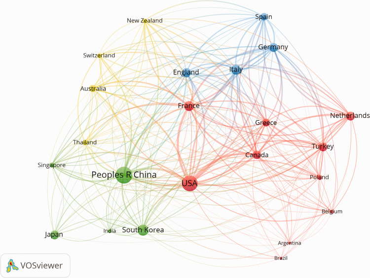
Figure 3.
Network visualization map for top publication countries/regions. The map was created using a threshold of n = 30 for analyzing the papers searching from Web of Science. Twenty-three countries/regions appear on the map. The more publications, the larger the circle. The thickness of the line represents link strength of collaboration between the countries, and the collaboration cluster between the countries is shown as four colors.

