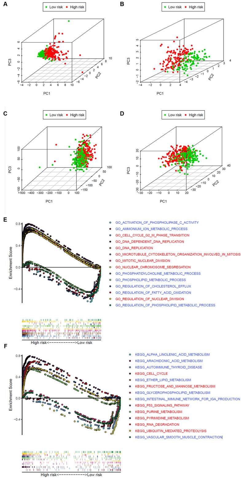
Figure 7.
The high‐ and low‐risk groups showed different distribution patterns and gene-set enrichment analysis. A. PCA of the high- and low-risk groups based on the 8 risk genes in the training set. B. PCA of the high- and low-risk groups based on 8 risk genes in the validation set. C. PCA of the high- and low-risk groups based on the whole genome set. D. PCA of the high- and low-risk groups based on the whole metabolism-related genes. E. KEGG and F. GO analysis by GSEA. The red font represents high-risk, while blue fonts represent low-risk.

