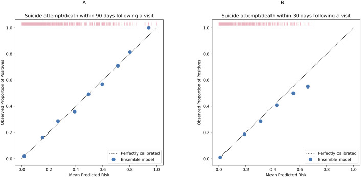
Fig 2.
Calibration plots comparing observed proportion of positives and mean predicted risk suicide attempt/death within 90 (A) and 30 days (B) following a visit to psychiatric specialty care during 2011 and 2012. The figure was based on the calibration of the ensemble models. Each solid dot in blue represents the observed proportion of index visits followed by a suicidal event in a bin of sample (observed proportion of positives [suicidal events]) against the mean predicted risk in the same bin. More details can be found in S9 Table. The rug plot in pink represents the distribution of the study sample across different predicted risk levels.

