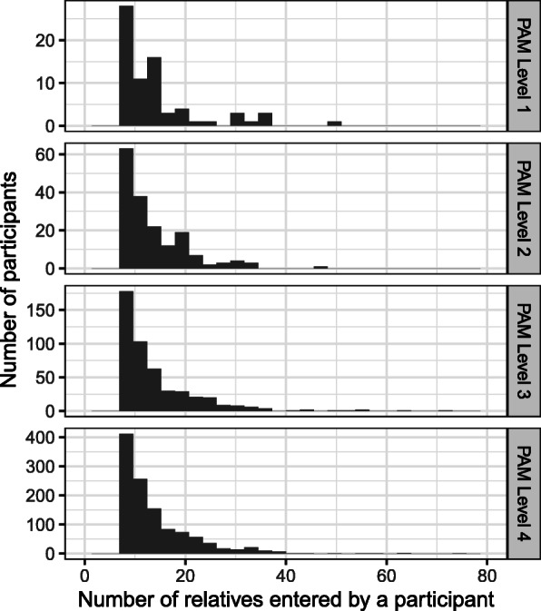
Fig. 1.

Distribution of the number of relatives entered by participants by their health care activation (PAM) level. Each panel represents the distribution of the total number of relatives entered by each participant with a PAM score at the designated level. The levels are shown on the bar on the left side of the image. The top panel represents participants who had the lowest PAM level, 1, and the bottom panel represents those with the highest PAM level, 4. The vertical axis on the right shows the number of participants and the horizontal axis the total number of relatives entered by each participant
