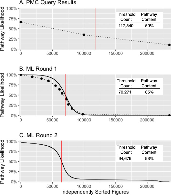
Fig. 5.
Machine learning performance. Classification of pathway figures assessed in a original PMC-sorted query results and b first and c second rounds of machine learning results independently sorted by estimated pathway likelihood (y-axis). Dots in a and b (connected by dotted lines) indicate where figures were sampled along their sorted indices for manual classification. These data were used in training subsequent rounds of ML. The solid black curves in b and c indicate the prediction of the learned model from each round of ML. The red vertical lines indicate the threshold used to define a set of pathway figures at each stage and assess their count and actual pathway content (inset tables). The final set of 64,643 pathway figures replaced 1.2% of known false positives and false negatives based on manual classification and was estimated to contain 94% pathway content

