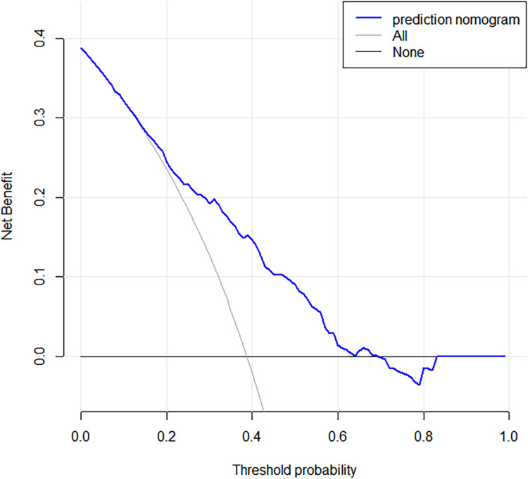
Figure 4.
Decision curve analysis for the predictive nomogram. The y-axis measures the net benefit. The blue line represents the intraductal tumor risk nomogram. The thin solid line represents the hypothesis that all patients have intraductal tumors. The thin solid line represents the hypothesis that no patient has an intraductal tumor.

