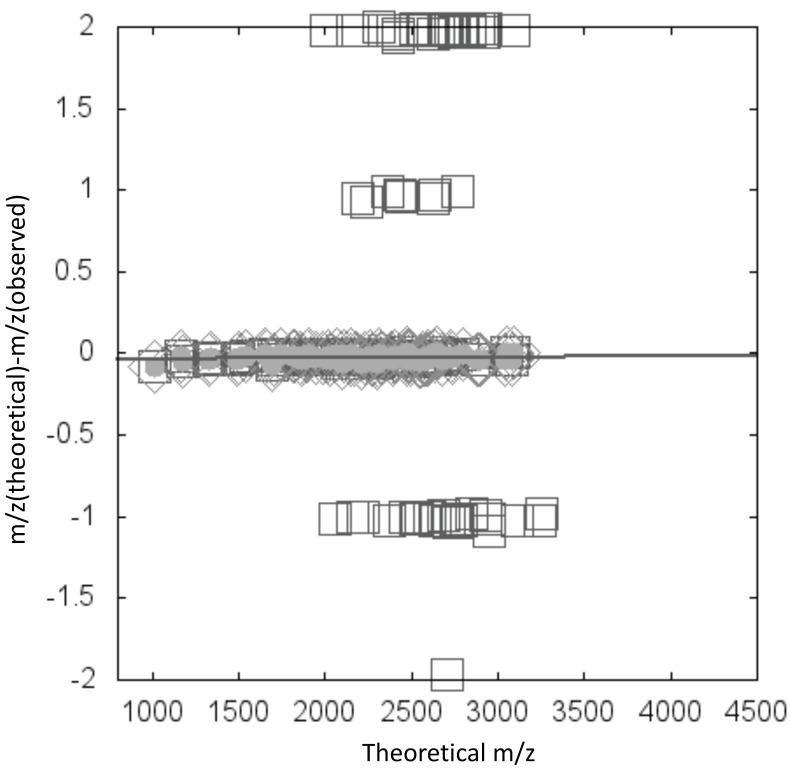
Figure 4.
Example of a scatter diagram in which the x-axis is m/z (theoretical) and the y-axis is the deviation between theoretical and observed m/z values. Diamonds indicate the maximum cluster. Data are fitted to a linear function, and line indicates the fit. Gray circles indicate annotated glycan data points within a certain distance from the fitted line.

