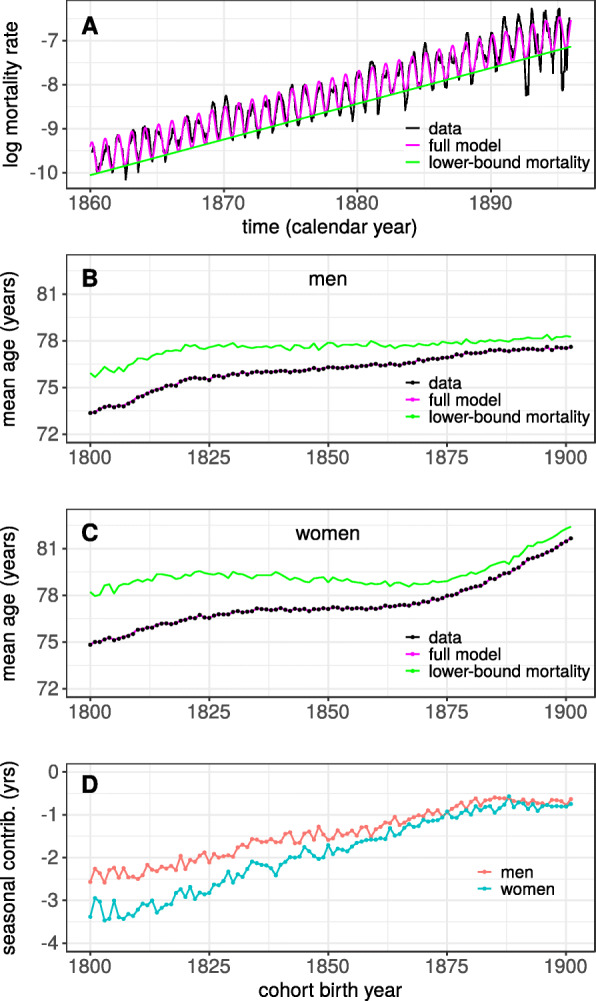
Fig. 4.

a Illustration of the mortality rate decomposition. Dashed line show mortality data for women born 1800, model fits are shown in magenta. The green line shows the first part, M1, in the decomposition given by Eq. 4, i.e., the lower-bound mortality. b Life expectancy at 60 for the different cohorts of men. Points show the actual data. The magenta line shows the prediction from the model (Eq. 6). The green line shows the predicted life expectancy, i.e., what life expectancy would have been had mortality rates been equal to the lower-bound mortality (Eq. 4). c same as in b but data for the cohorts of women. d Difference between observed mean life duration and mean life duration based on lower-bound mortality in years
