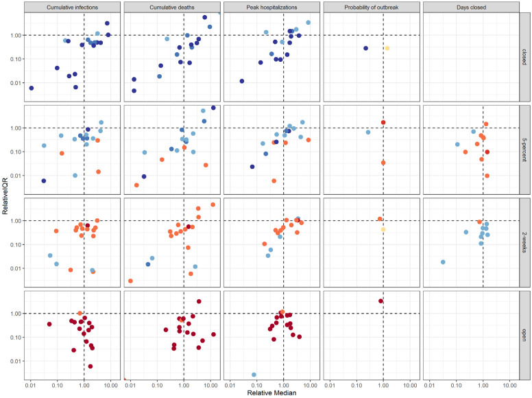
Fig. 5: Comparison of individual model results to aggregate results.
The y-axis shows the relative interquartile range (IQR)—the ratio of an individual model’s IQR to the aggregate IQR. The x-axis shows the ratio of an individual model’s median to the aggregate median. Both axes are presented on a log scale. Colors denote ranking of each intervention by models, where dark blue signifies the lowest value (best performance) and dark red signifies the highest value (worst performance). Ties between ranks 1 and 2 and ranks 3 and 4 are shown as an intermediate blue and red, respectively; yellow indicates a tie in ranks across all interventions.

