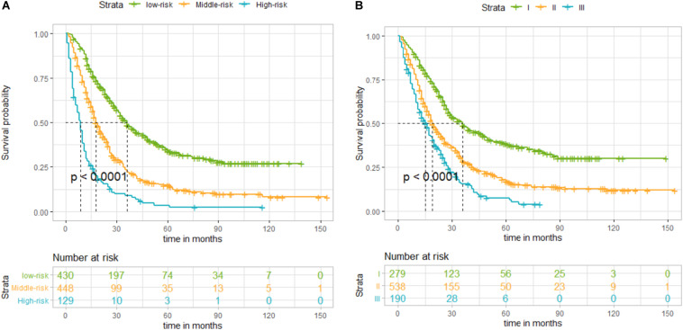
FIGURE 3.
(A) Kaplan–Meier curves of disease-specific survival (DSS) for patients according to the risk groups of the nomogram in the training set: blue line denotes high risk, yellow line represents medium risk, and green line denotes low risk. (B) Kaplan–Meier curves of DSS for patients according to stages I, II, and III of the 8th edition of American Joint Committee on Cancer (AJCC8) in the training set. The blue line denotes stage III, yellow line represents stage II, and green line denotes stage I. The nomogram showed a superior ability to classify the risk stratification of patients.

