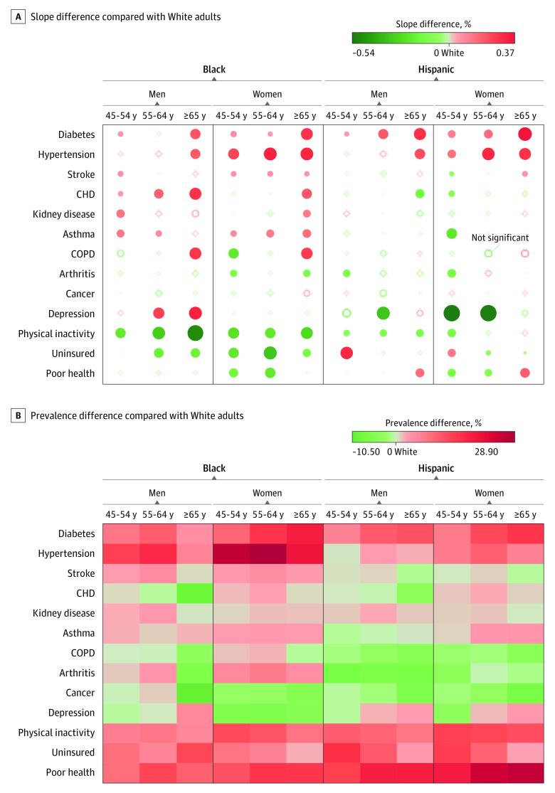
Figure 2. Difference in Slope and the Prevalence of Health Outcomes Compared With White Individuals Among Middle-aged and Older Racial/Ethnic Minority Groups in the US.
A, Slope difference compared with White individuals, 1999-2018. Red indicates diverging patterns (ie, widening gaps), and green indicates converging pattern (ie, narrowing gaps). The size of the dots corresponds to the magnitude of the slope difference to White adults. B, Prevalence difference compared with White individuals, 2009-2018. Red indicates results that are worse than for Whites adults, while green indicates results that are better than for White adults in terms of prevalence rates; for example, the trend lines for Black and White adults in physical inactivity are in the green light heading toward a right direction, but the prevalence of physical inactivity among Black adults remains unimproved. The β coefficient indicates the slope of yearly percentage of prevalence change. CHD indicates coronary heart disease; COPD, chronic obstructive pulmonary disease.

