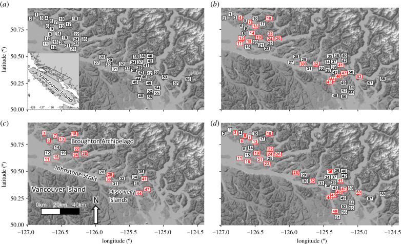
Figure 1.
A map depicting (a) all farm tenure sites included in this study as well as individual maps for each sampling year, depicting (b) 2016, (c) 2017, and (d) 2018 sampling sites. Label colours in b, c, and d indicate which sites contained active salmon farms (red) and those that were inactive (black) at the time of sampling. Numbers correspond to site numbers in electronic supplementary material, table S1, which contains information on site status for each sampling year. (Online version in colour.)

