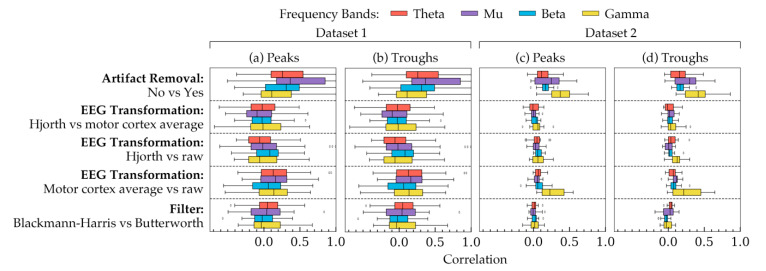
Figure 5.
The correlation coefficients, calculated using phases from all subjects, showing how choices in each method are correlated to each other. The coefficients are shown for (a) the peak phase trials within all subjects in Dataset 1, (b) the trough phase trials within all subjects in Dataset 1, (c) the peak phase trials within all subjects in Dataset 2, and (d) the trough phase trials within all subjects in Dataset 2. Each row, separated by a dashed line, represents the correlation between a pair of choices within a method. The remaining two methods were kept constant for each row. The constant values were as follows: artifact removal = yes, EEG transformation = raw, filter = Butterworth. The four frequency bands are highlighted in four different colors. The boxes indicate the quartiles of the samples while the whiskers extend to show the rest of the distribution up to 1.5 inter-quartile range. The dots indicate the outliers in the figure.

